
Popular Media Queries for Responsive Web Design

There are a lot of great responsive boiler plates around, and my personal favorite is Bootstrap on GetHub. It’s even highly customizable with close to hundred (I didn’t count) components you can select or modify in the download package. Even with this I still prefer to do things myself, because I find frameworks and boilerplates often bloated with functionality I don’t need, or they can’t quite meet the requirements of my design except with lots of tweaking that usually ends in a headache.
I do feel these frameworks and boilerplates are great things to hack apart, learn from, and use portions of in your designs and code.
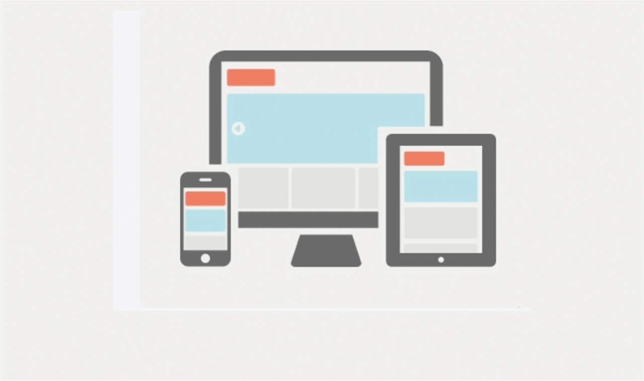
The first question you need to ask is what are the common screen sizes to design for? Well here’s my list and what most of the boilerplates and frameworks are using, and in my opinion the best media queries to use for responsive design. And there’s only 4 of Them!
Large Display – 1200px and up
/* Large desktop */
@media (min-width: 1200px) { ... }
These are the new standards for desktop browsing, witht he most common resolution 1366×768 23.2% of the global resolution. With over 60% of total screen resolutions using a display larger than 1200px, some stat counters have this number even higher, W3Schools reports it at over 90% above at 1024 resolution. This is clearly the new standard, and what I design my default designs in now, and work down from there.
Dated Display – 980px and up
/* Landscape tablet and dated desktop */
@media (min-width: 980px) and (max-width: 1199px) { ... }
Displays with resolution of 1024, the old standard is only 14.7% and steadily falling. Any smaller than that in desktops and laptops are slim, and a mobile version will be served up for those few, yielding them an excellent viewing experience anyways.
Portrait Tablets – 768px and up
/* Portrait tablet to landscape and desktop */
@media (min-width: 768px) and (max-width: 979px) { ... }
This media query will be what most tablets server up to viewers. Stats where a bit unclear in this area, but it is a growing segment, and will be served up on older desktops and laptops.
Phone to Tablets – 767px and down
/* Landscape phone to portrait tablet */
@media (max-width: 767px) { ... }
This makes up a market of about 10% of mobile traffic, many small tablets will also use this media query.
Phones – 480px and down
/* Landscape phones and down */
@media (max-width: 480px) { ... }
By far the most popular resolution for smart phones. About 30% of mobile traffic is below 480px, and a total of 14.5% of total web traffic is mobile.
These statistics are estimates only using data from Gs.Statcounter.com. I’m not a statistics expert either and some of these numbers have been rounded and approximated by myself.
Sumber: http://lawrencestewart.ca/popular-media-queries-for-responsive-web-design/


