Pastel Color Schemes for Refined Website Design
Pastel color schemes will definitely win Oscar for the most “elegant role” among other palettes used in web design. Sites taking minimal approach by using washed out color scheme, call a feeling of sophistication and purity. These days, when uncluttered designs like Scandinavian (extremely clean with cold colors), flat and minimal rock the web, websites in muted colors are in a great favor.

If you look at most sites, you’ll notice how clean they are. The lightness of their designs reminds the one of the feather. A lot of negative space, light color schemes – nothing annoying is used there. Among such designs there is a great variety of the examples using pastel colors, and I’m going to inspect them in this blog post. To make your journey around it quite interesting, I’ll not bug you with long descriptions and endless examples, just several paragraphs illustrated with sites and their pastel color schemes. Each scheme goes with HEXes, so it may be not only inspirational, but also a useful compilation showing successful variants of color combinations used in design.
* * *
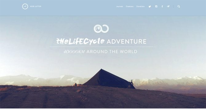
The Lifecycle Adventure

* * *
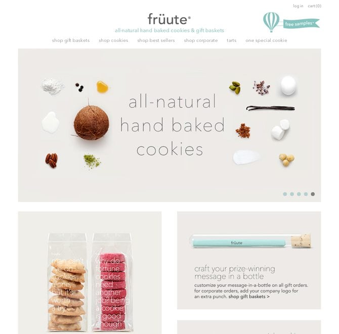
Fruute

* * *
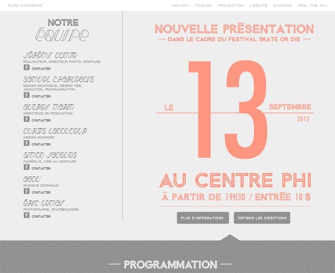
Rueda Film

* * *
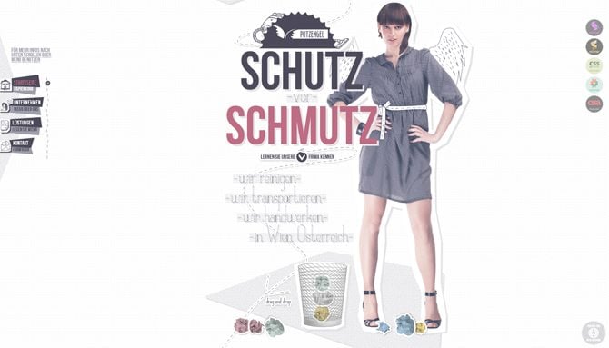
Schutz Schmutz

* * *
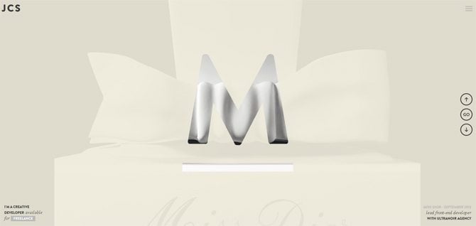
Jean Christophe Suzanne

* * *
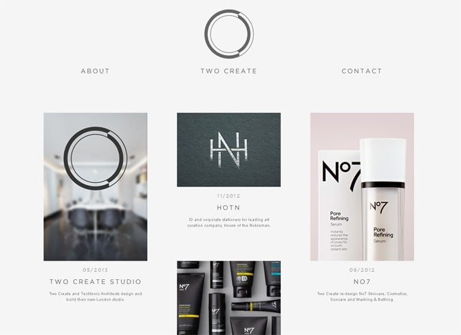
Two Create

* * *
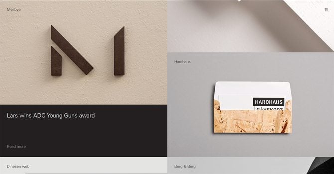
Heydays

* * *
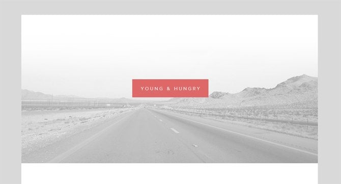
Young & Hungry

* * *
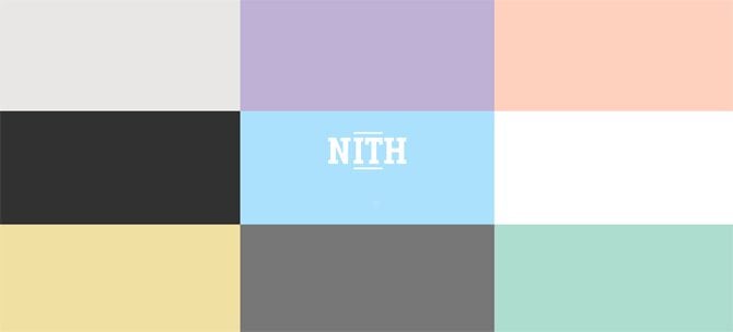
Fremtidens Hoder

* * *
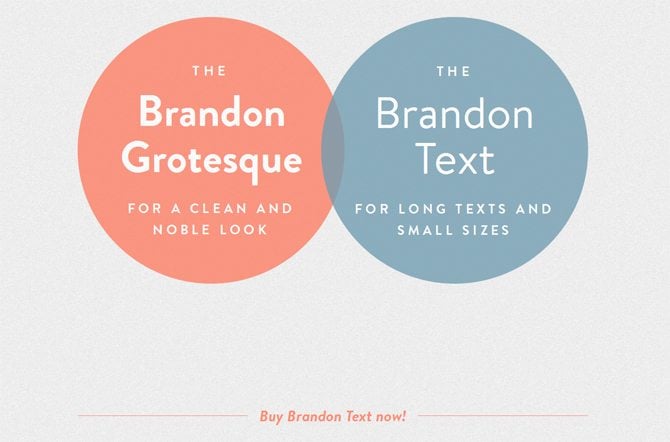
HVD Fonts

* * *
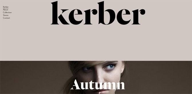
Kerber

* * *
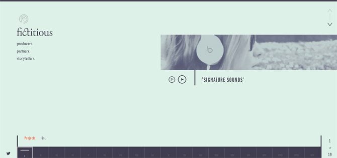
We Are Fictitious

* * *
Wootten


* * *
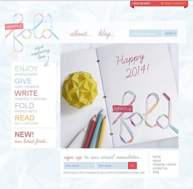
Upon a Fold

* * *
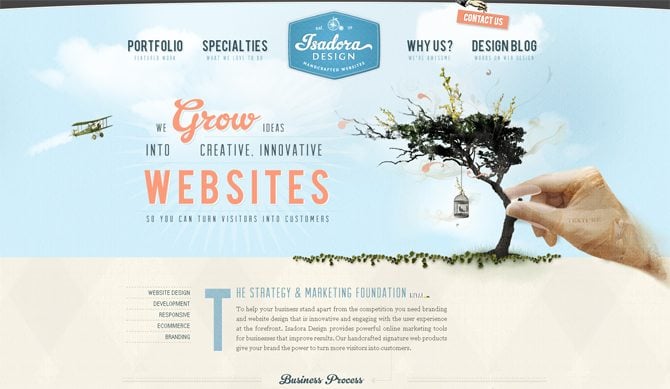
Isadora Design

* * *
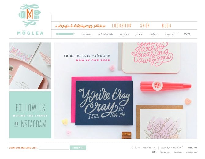
Moglea

* * *
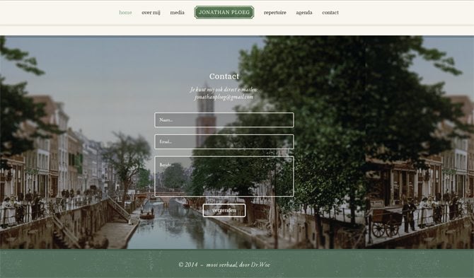
Jonathan Ploeg

* * *
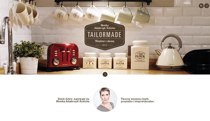
Tailor Made

* * *
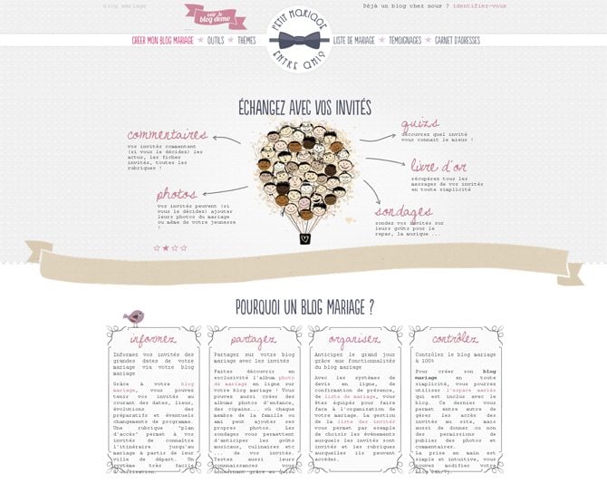
Petit Mariage Entre Amis

* * *
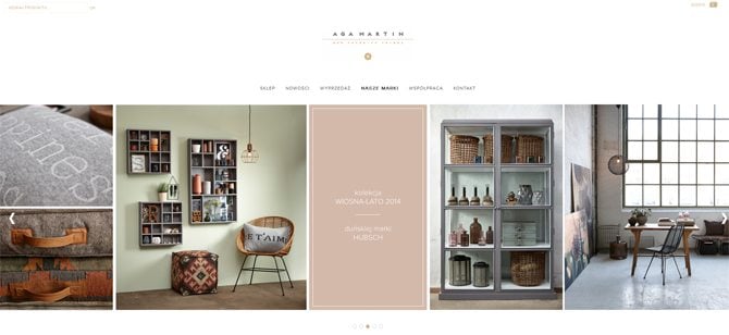
Aga Martin

“masculine” designs
* * *
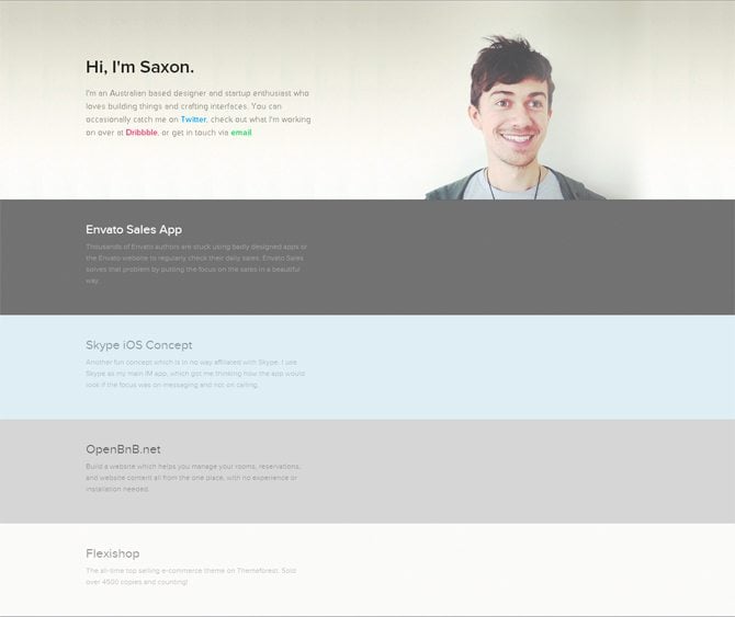
By Saxon

* * *
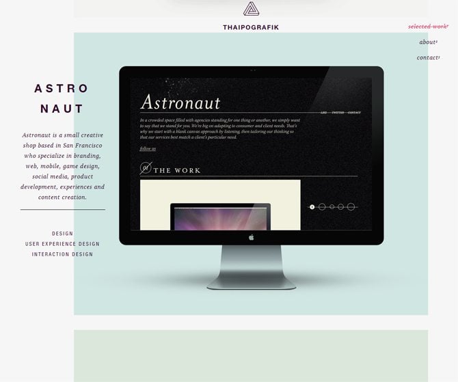
Thaipografik

* * *
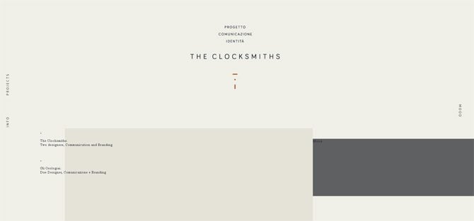
The Clocksmiths

* * *
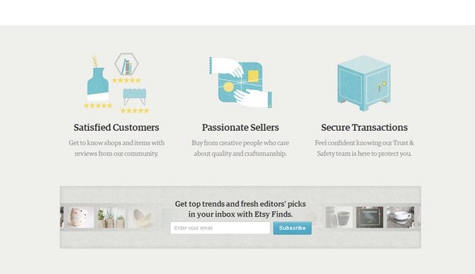
Etsy

* * *
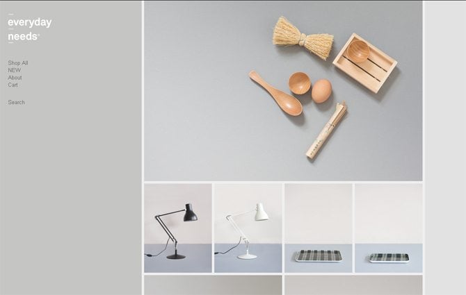
Everyday Needs

“feminine” designs
* * *
Alyssa B Noel


* * *
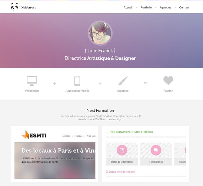
Xbition Art

* * *
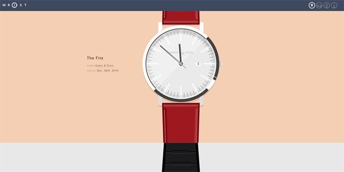
Wrist

* * *
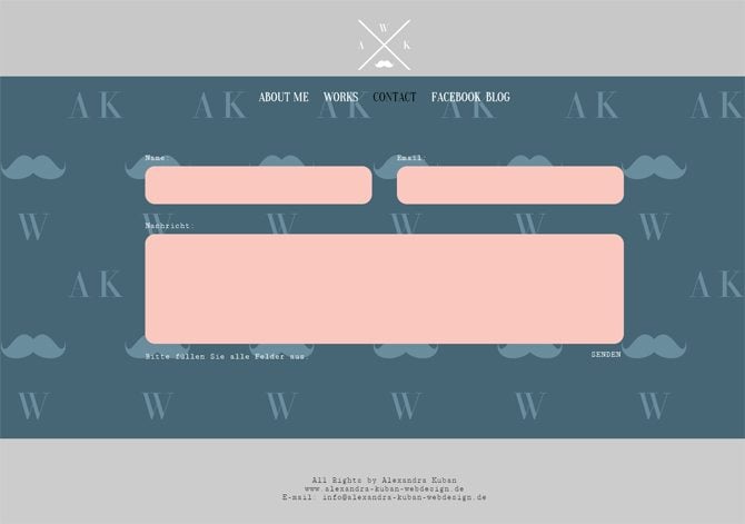
Alexandra Kuban Web Design

* * *
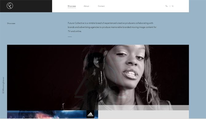
Future Collective

* * *
The way a certain site impacts its visitors depends on colors used in its design. They are really a powerful tool that can draw attention, guide viewers through the page and stir emotions. Today’s web chooses simple and minimal approach to designs, and pastel color schemes are in favor. Looking appealing to the viewers, they add a sophisticated tone to the site design and call pleasant emotions. Sites with muted color palette look extremely clean and modern.
A trend or fad? That’s not a question about pastel colors in design, that’s a choice of designers who strive to create visually appealing works. Every year brings new trends, but design classics like pastel color palettes still holds its positions.
Sumber: http://blog.templatemonster.com/2014/03/05/pastel-color-schemes-for-refined-website-design/

If you look at most sites, you’ll notice how clean they are. The lightness of their designs reminds the one of the feather. A lot of negative space, light color schemes – nothing annoying is used there. Among such designs there is a great variety of the examples using pastel colors, and I’m going to inspect them in this blog post. To make your journey around it quite interesting, I’ll not bug you with long descriptions and endless examples, just several paragraphs illustrated with sites and their pastel color schemes. Each scheme goes with HEXes, so it may be not only inspirational, but also a useful compilation showing successful variants of color combinations used in design.
What are Pastel Colors?
They have low/medium saturation, a soft, subdued shade and lack strong chromatic content. They are called soft, neutral, soothing, milky, hazy, washed out, desaturated, etc. They are never bold, they look soft and they’re easy on the eye.* * *
The Lifecycle Adventure


* * *
Fruute


* * *
Rueda Film


* * *
Schutz Schmutz


* * *
Jean Christophe Suzanne


* * *
Two Create


* * *
Heydays


What are They For?
There are several ideas behind the usage of a certain color scheme in design: supporting brand identity colors, creating certain tone of a web presence, calling the desired emotions of the viewers.Pastel colors communicate soft and friendly atmosphere of a website, thus evoking calm feelings. There is not a wide range of hues in pastel color scheme, that’s why designs implementing it never look oversaturated. To sum up, muted colors are all about softness and sophistication, giving lighter and more refined look to the site.* * *
Young & Hungry


* * *
Fremtidens Hoder


* * *
HVD Fonts


* * *
Kerber


* * *
We Are Fictitious


* * *
Wootten


Where to Apply?
The most popular places of implementation are the following: background (textures and images), logos, icons, fonts, frames. Of course, it doesn’t matter where you have applied several muted colors. The main point is the result you have achieved – elegant and polished look of the site. Most vintage and flat designs like pastel color schemes, ‘cause they perfectly work for creating the desired retro or clean and precise atmosphere.* * *
Upon a Fold


* * *
Isadora Design


* * *
Moglea


* * *
Jonathan Ploeg


* * *
Tailor Made


* * *
Petit Mariage Entre Amis


* * *
Aga Martin


Too Feminine?
Adding a light tone to the design, pastel color schemes are considered to be feminine sometimes, but it’s partially true. Of course, creamy colors of a site hint at its non-masculine nature. Lightness, softness are undoubtedly feminine characteristics that perfectly work for websites with women as a target audience. It doesn’t mean that serious web presences (business, design agencies, personal pages) don’t make use of these well-balanced colors. Such schemes look a bit colder, but still underline sophistication of masculine designs.“masculine” designs
* * *
By Saxon


* * *
Thaipografik


* * *
The Clocksmiths


* * *
Etsy


* * *
Everyday Needs


“feminine” designs
* * *
Alyssa B Noel


* * *
Xbition Art


Contrasting Pastel
Pastel color schemes can also be visually-contrasting due to the mix of one or two washed out colors with a strong one (dark grey, for example). They still behave as pastel, but create more contrasting effect.* * *
Wrist


* * *
Alexandra Kuban Web Design


* * *
Future Collective


* * *
The way a certain site impacts its visitors depends on colors used in its design. They are really a powerful tool that can draw attention, guide viewers through the page and stir emotions. Today’s web chooses simple and minimal approach to designs, and pastel color schemes are in favor. Looking appealing to the viewers, they add a sophisticated tone to the site design and call pleasant emotions. Sites with muted color palette look extremely clean and modern.
A trend or fad? That’s not a question about pastel colors in design, that’s a choice of designers who strive to create visually appealing works. Every year brings new trends, but design classics like pastel color palettes still holds its positions.
Sumber: http://blog.templatemonster.com/2014/03/05/pastel-color-schemes-for-refined-website-design/


